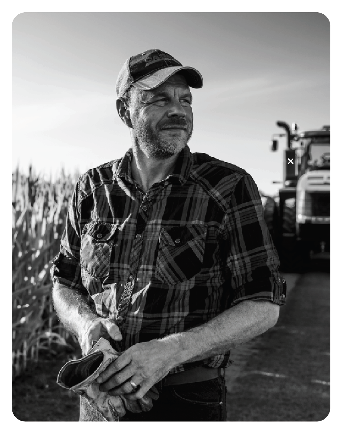
Built By Farmers is a complete 360-degree awareness platform that features stories of the people at CASE IH who are farmers or have farming experience. These people bring that innate knowledge to the equipment they manufacture. These stories go beyond the employees and include dealers, service techs, country artists, and other things outside of farming that farmers built.
FIRST: M1 wanted a series of social videos to build its name recognition in the growing fintech space. The reception and feedback to this series were incredible, and it wildly surpassed its new customer goals.
SECOND: M1 was thrilled with the response to their awareness videos and asked for help teasing the launch of their new credit card. The goal for the teaser was 5K sign-ups in 5 days. We archived 15 K. Then they asked for a retail video with the goal of 35K. We hit 55 K. BOOM!
Shepherd, Sherpa, and Sheriff of Wilson’s brand and DNA while coaching, mentoring and fostering talent on the team.
Adopting a creative-agency model, improving workflows, and expanding in-house capabilities and reach across the global network.
Hiring and overseeing outside partners and vendors.
Here is just a sample of work: style guides, graphics, package design, retail displays, apparel, social videos, films, and events.
THE ONE FOR ALL SINCE 1923 – To honor this iconic tractor’s 100th-year milestone, my team and I developed a full-year social media first campaign. Inspired by history museum exhibits. With the narrative,
One hundred years of stories, 100 years of milestones, innovations, family, design… you get the idea. This campaign came to life across multiple social channels. A dedicated site, films, C-TV, high-impact digital engagements, events, contests, and some print.
This collection features a diverse range of brand designs, packaging, logos, posters, advertisements, and title treatments, from agency work and my own clients.
Regenerative agriculture is a management philosophy that seeks to improve soil health. At its core, regenerative agriculture is restoring degraded soils using practices (e.g., adaptive grazing, no-till planting, no or limited use of pesticides and synthetic fertilizer, etc.)
For Vayda, a startup in this fast-growing space, we approached their story about soil health without showing soil or repetitive, romanticized images of lush crops or speaking to “feeding the world.” Our focus is on the business of farming. Like any business, growers want to do what’s right. To do that, they must look for new tools and practices to maintain sustainability and drive growth.
The visual language uses topographical maps laid over satellite photos and subtle plotting grids with a muted color palette. It also combines watermark photos to balance people and emerging tech. Simple yet strong typography complements this.
I had the opportunity to name and define a minimalist design philosophy to guide and inspire the future of racquet sports. Building on that foundation, I introduced new performance racquet packaging that reflected both the philosophy and the brand strategy, about the symbiotic relationship between Wilson and its athletes.
This new direction allowed us to remove all other sponsors’ names and logos from the designs.
All athletes and their management approved the direction within weeks. Without a single change, virtually unheard of in the industry. “Best in twenty years,” according to global field teams.
The success extended into retail, leading to redesigned environments across the U.S., shop-in-shops in Europe and Asia, and brand consultation for the apparel team.
The performance line went on to achieve 33% sales growth, a clear signal that the new design direction resonated from shelf to court.
In the early hay-day of day trading, Ameritrade wanted a different POV. So, we took two of the most iconic representations of Wall Street and made a buddy story. The straight man and the comedian. Good cop/bad cop. Co-workers who hang out but always throw verbal jabs at each other. Just like a typical day at the office. As the first of its kind in this category. The videos put the animated characters in a live-action setting. The print consisted of underground propaganda-style placards to run in the financial pubs and be posted around financial districts.
This was the first commercial 3D CGI project for Aardman Studios.
Here’s a mix of films that I still love.